FAUTOR
Packaging
- Client
- FAUTOR
- Year
- 2021
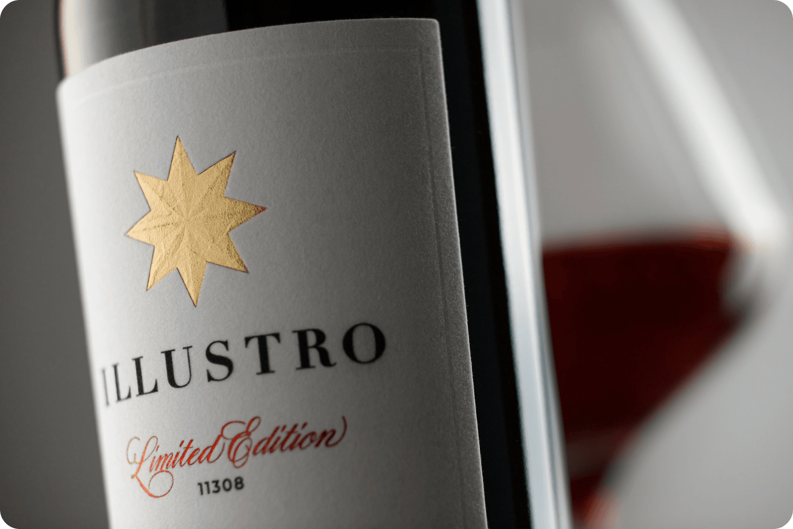
Redesign of the ILLUSTRO wine series
Objective
Creating a new look for the most expensive wine line in the company's portfolio, a line that has been on the market for more than ten years.
Solution
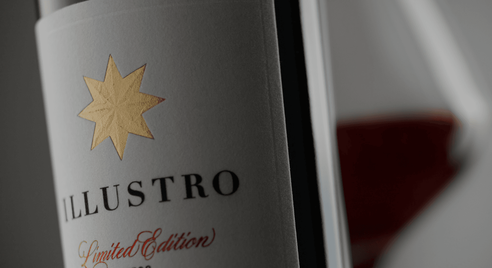
“Classic”, “respectability”, “premium” - these are the core values chosen to be conveyed through the new ILLUSTRO design. The series' look had to contrast with the rest of the FAUTOR wines, feel more substantial and sit, in the mind of the consumer, alongside the finest examples of classic European winemaking.
The information structure of the label has been carefully worked out. For wines of the highest quality, clear and understandable descriptive details are especially important, and on the label they are grouped conveniently and elegantly.
The information structure of the label has been carefully worked out. For wines of the highest quality, clear and understandable descriptive details are especially important, and on the label they are grouped conveniently and elegantly.
Redesign of the ILLUSTRO premium wine series by FAUTOR

1 / 2