A BEE ROAD
Naming / Identity / Packaging
- Client
- A BEE ROAD
- Year
- 2026
Brand concept, naming, visual identity, and packaging design for A BEE ROAD
Objective
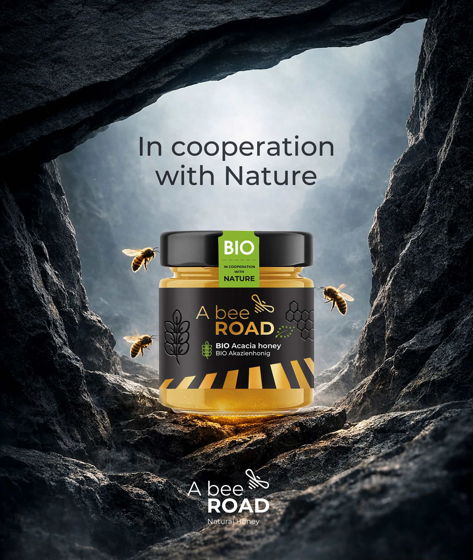
The agency was tasked with creating a honey brand concept that would significantly depart from conventional approaches typically seen in this category. The objective was to develop an idea capable of positioning honey produced in the ecological environment of Moldova in an unconventional and non-literal way, while deliberately avoiding direct associations with its region of origin.
Solution
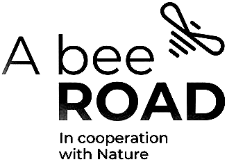
The name “A Bee Road” not only expresses the core concept of the brand, but also resonates with universal cultural values, particularly those associated with music.
Identity
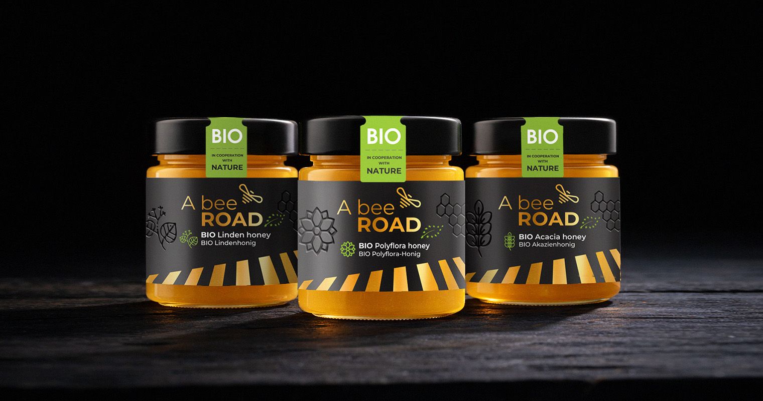
This accent references a piano keyboard motif, rendered in the characteristic black-and-yellow colors associated with bees, while also evoking the image of an iconic pedestrian crossing. The element connects the musical resonance of the name with the rhythm of nature and the movement of bees, adding an expressive visual layer to the identity.
The unconventional brand concept makes it possible to creatively reinterpret the visual elements of the identity across a wide range of marketing applications and brand collateral.
Design
The result is a calm, elegant design that avoids the decorative clichés typical of honey packaging and instead focuses on clarity, recognition and storytelling.
The packaging design extends this system across the product range. Labels are deliberately minimal, allowing the natural golden color of honey to become part of the visual composition.
By transforming the simple observation of a bee’s flight into a naming concept and visual language, A Bee Road creates a brand where nature, culture and design meet along the same road — the road of the bee.
Produced in the ecological conditions of Moldova and aimed at a discerning European audience, the honey is built around the brand’s central message: the idea of the “bee’s road” — the journey this tireless creature must undertake to gather and accumulate within the honey the floral gifts of local nature.
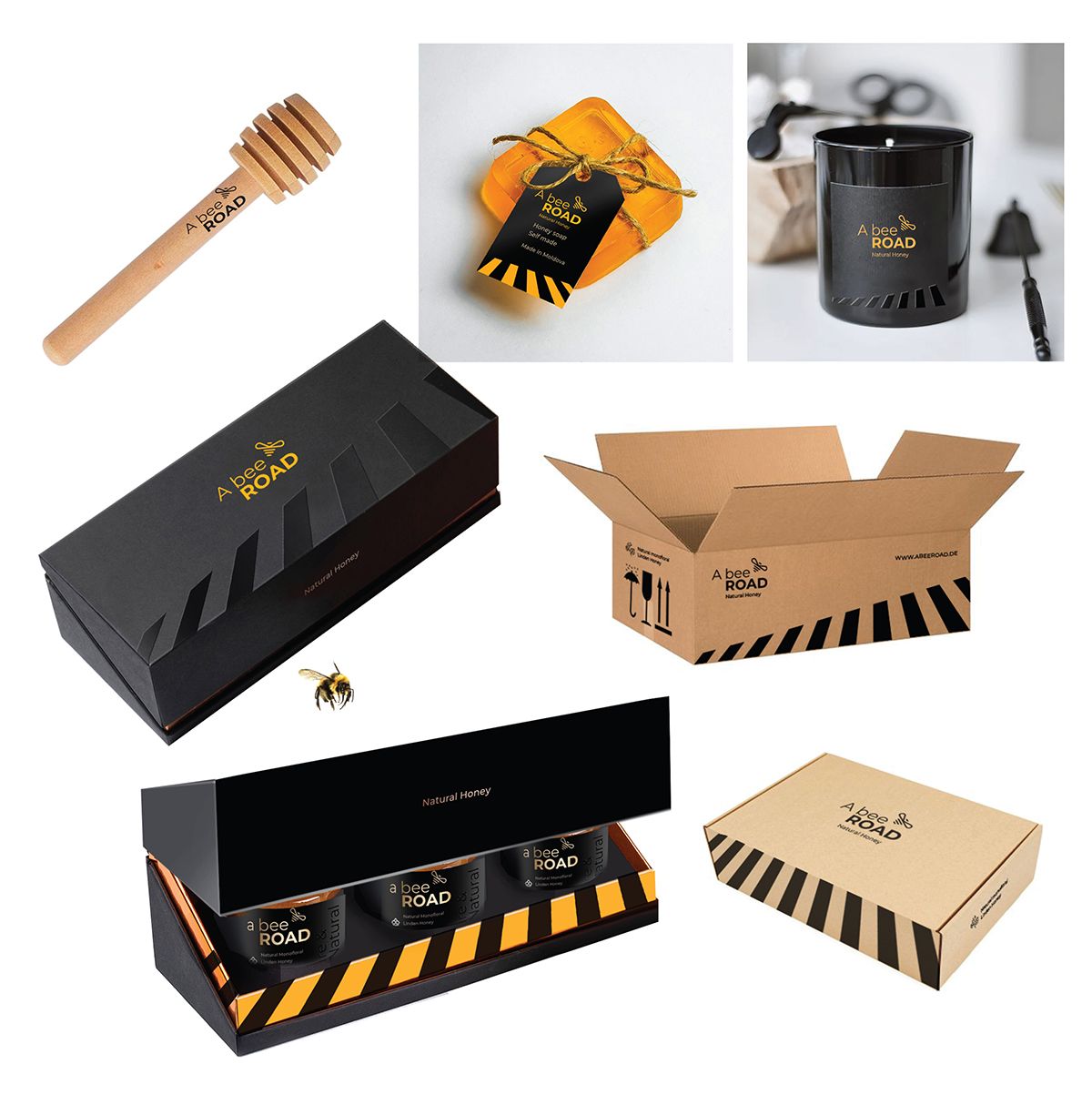
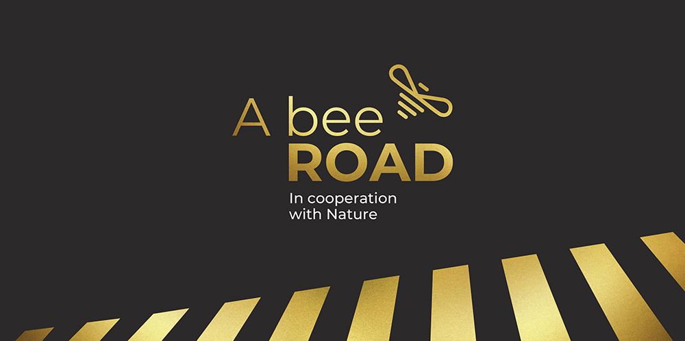
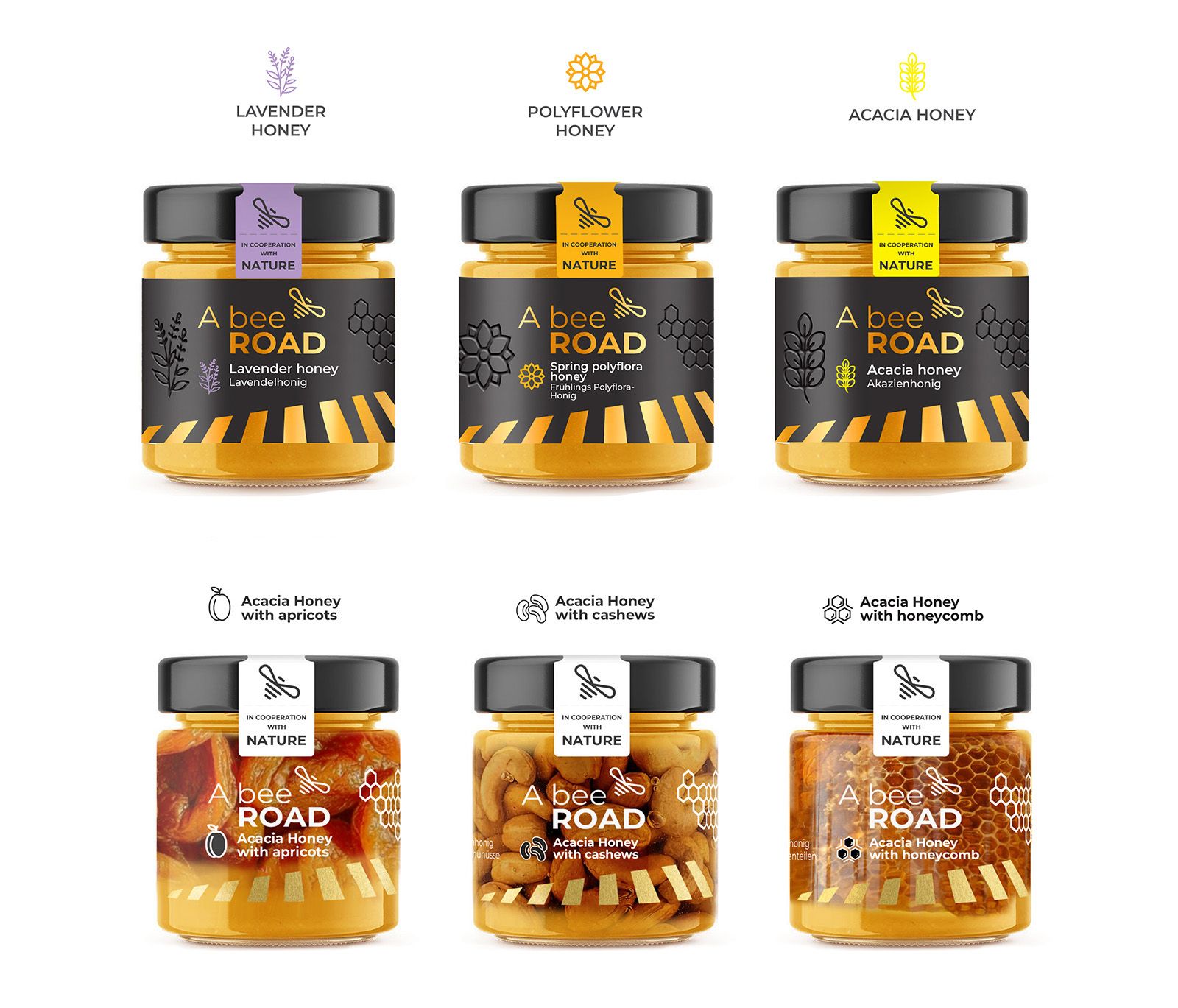
The visual identity is intentionally clean and modern. A restrained typographic logo creates a clear and confident brand presence, while a bright graphic accent introduces the brand’s distinctive character.