OBJECTIVE
Redesign of the ILLUSTRO premium wine series by FAUTOR
Creating a new look for the company’s most premium wine line — a line that has been active in the market for over ten years.
PROBLEM
ILLUSTRO is a special wine series within FAUTOR’s portfolio. Produced in limited quantities for more than a decade, it has become a symbol of quality and an individual winemaking vision—not only for FAUTOR, but, to a significant extent, for Moldovan winemaking as a whole.
The issue with the ILLUSTRO series lies in its current design, which, according to FAUTOR’s own representatives, fails to convey the significance of the range and, moreover, does not align with the perception of FAUTOR as a creator of distinctive premium wines.
SOLUTION
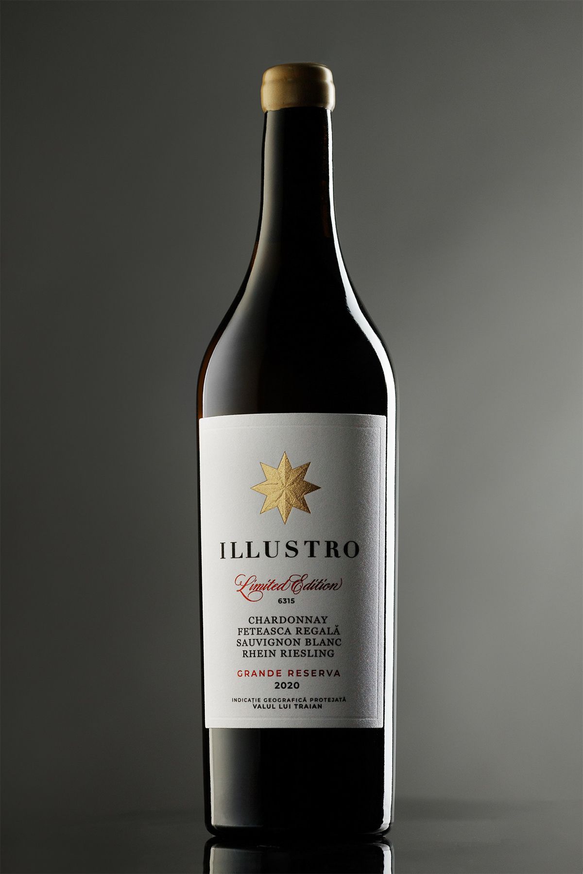
“Classic,” “respectable,” “premium” — these were the core values chosen to be conveyed in the new ILLUSTRO design. The series’ appearance needed to contrast with the rest of FAUTOR’s wines, be more substantial, and resonate mentally alongside the finest examples of classic European winemaking.
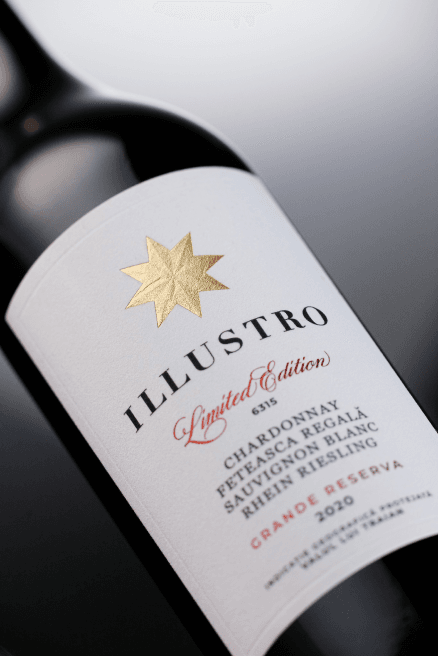
The informational structure of the label has been carefully refined. For wines of the highest quality, clear and understandable descriptive characteristics are especially important, and on the label, they are grouped in a convenient and elegant manner.
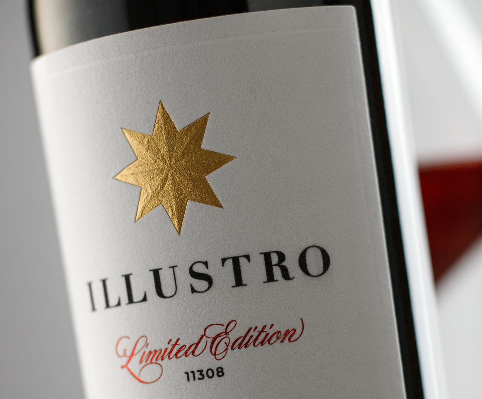
Alongside the name, the star icon serves as a link to the previous design version. In the new design, it has been elegantly reinterpreted and printed in a way that turns it into a small yet eye-catching detail of the label.