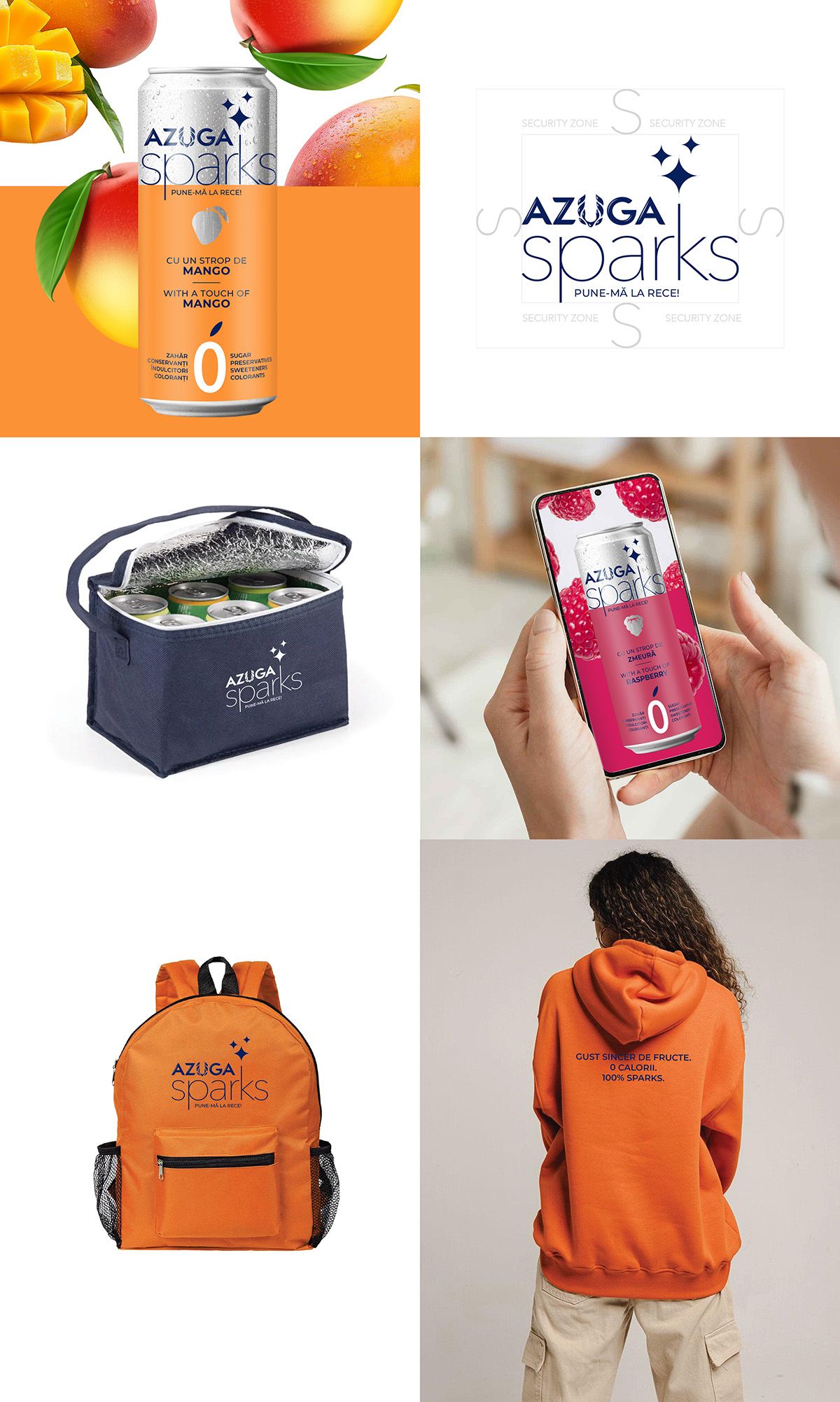
OBJECTIVE
For AZUGA, one of the fastest-growing mineral water brands on the Romanian market, it was necessary to create the design for the AZUGA SPARKS line of sparkling water with natural fruit flavors.
The project also included the development of the AZUGA SPARKS sub-brand logo, based on the existing umbrella brand logo AZUGA, in a way that would communicate the advantages of the new product while becoming an organic part of the packaging design.
SOLUTION
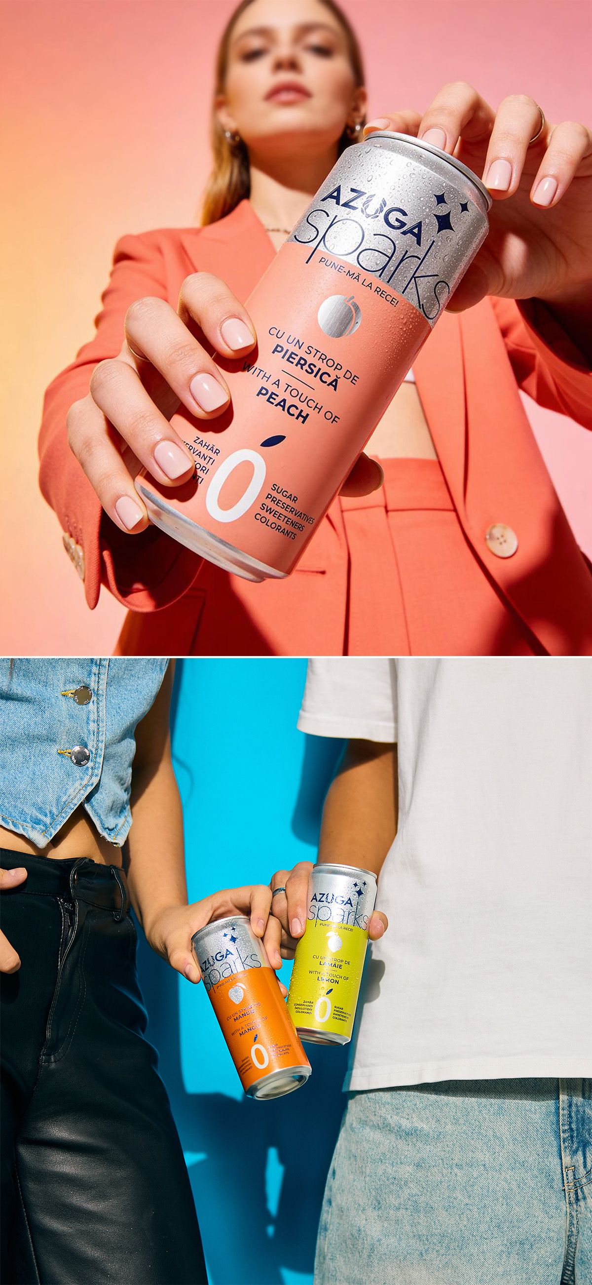
The aluminum can format and expressive visual system are aimed at an active audience for whom rich flavor naturally aligns with a demand for purity and naturalness.
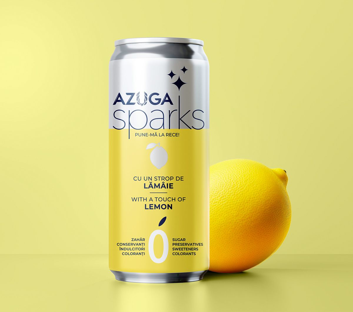
The AZUGA SPARKS logo adds a sense of “spark” to the brand, enhancing the crystal-clear, mountain-inspired minimalism of the core AZUGA lettering.
DESIGN
The brand zone on the packaging is clearly structured and separated from the background area, where color becomes the key flavor marker — each shade directly associated with a specific fruit.
Essential information is distilled into concise formulas and symbols, transforming into an active design element that instantly communicates the product’s unique benefits to the consumer.
IDENTITY
A comprehensive AZUGA SPARKS brand book was developed, providing the client with effective tools for building a consistent and contemporary brand image.